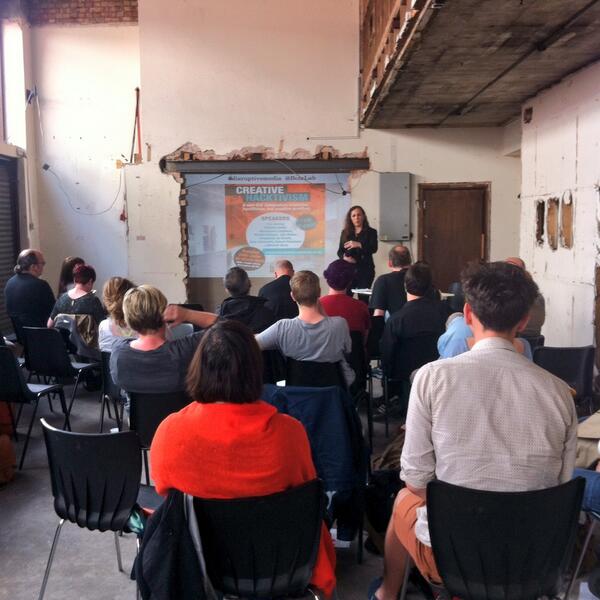
The Creative Hacktivism seminar at the not-even-started-the-refurb BOM venue had the usual mix of good and dull stuff but the highlight was probably Robert M Ochshorn whose presentation reminded me of being at Resonate a few months ago. He’s one of those people who casually demonstrates something that is effectively from “the future” and then more casually mentions he’s moved on from that a couple of years ago. He also ran his presentation from the command line. No powerpoint, just shell commands. Hardcore. Sadly his website has nothing on it relating to his talk - he did apologise for this - but I made copious notes in big exciting handwriting.
One of his goals is to visualise a whole film at once, to be able to visually browse a time-based medium. Related to this was a PDF reader where the thumbnails were displayed behind a floating reader window showing where in the publication you are. These are not novel. Video editing has a visual scrubber. PDFs have thumbnail views. But the way he integrated these into the reading / viewing experience was interesting.
Where he used slitscan to visualise films obviously caught my attention since I’m well into slitscan though I’d not thought of it as a way of effectively thumbnailing a temporal sequence. A film still just captures 1/24th of a second. A slitscan shows, or at least represents, a much longer period of time.
But using slitscan as an indexing tool implies a level of literacy which we might take for granted in other forms. I asked Robert about this and he agreed. We do “read” thumbnails and try to make sense of their abstractions. This is not something I’d really considered before but it ties in with a lot of my thinking, bringing photographic composition into the realm of symbolism and such. One of those nice “click!” moments.
One of Robert’s projects was a visual index of every Godard film. The screen showed them all as slitscanned thumbnails which the viewer could scrub through, amongst other things. I was struck by how the traffic jam scene, made with long tracking shots, in Weekend jumped out and was immediately recognisable to me. Another scene of a woman dancing in a window was not necessarily recognisable but clearly showed a moving subject shot with a fixed camera. Similarly you can tell when the film is full of fast jump-cuts because the scan becomes noisy.
Slitscan images made from films are interesting because they compress time into a single image. But if you don’t know how a slitscan is made you might assume it’s still an image of a single moment, not lots of moments compressed into one.
This evening I tried an experiment. I took that traffic jam scene from Weekend and turned it into a slitscan (extracting 10 frames per second). It looks like this. (click for full size)
I also squashed it into a 3:2 rectangle.

I then posted it to Twitter, telling people it was a scene from a film and asking them to name it. Here are the answers people gave:
- The Italian Job
- Monty Python and the Holy Grail (French castle scene)
- Monty Python and the Holy Grail (Knights who say Ni)
- Falling Down
- Get Carter
- Shaun of the Dead (back garden first zombie scene)
- Four Weddings and the Funeral
- Life of Brian (stoning scene)
- Clockwork
- Quadrophenia
The Italian Job was the most popular guess and the cars do look a bit like Mini Coopers in Red White and Blue.
What I think we’re seeing here is thumbnail literacy but for stills rather than for slitscan. Most people don’t know how a slitscan is made, even those who’ve been following my work. The idea that this represents 7 minutes or so of a film is not obvious. So people fall back on the more common method of looking for symbols and icons. Those colours, the era. Interesting that along with The Italian Job you also have Get Carter and Quadrophenia.
On reflection I maybe should have chosen a more well known film (only one person got it right) but the wrong answers were actually more interesting. They show they is some kind of dominant thumbnail literacy out there and that if we want to use different sorts of visual abstractions to represent time and space we need to take those into account.
Pic at top by Joseph Kesisoglou


It was the colours for me, and the way they looked graded from that film period, i.e. late sixties/early seventies, and not blockbuster, but rather the lower budget and art cinema, very interesting, id like to see more, its fun
Daniel :~}